Updated Checkout
Role
UX/UI Designer
UX Research
UX/UI Design
Prototyping
Responsibilities
Ryan Robertson (Product Owner)
Natalie Borboa (Product Manger)
Edward Leong (Development Team Lead)
MaginX (Development Team)
Team
The checkout process is a critical component of our e-commerce platform, directly impacting user satisfaction, conversion rates, and overall revenue. Our current checkout process, however, has become outdated and is no longer aligned with modern UX/UI standards or the expectations of our customers. Recognizing the need for a more streamlined, user-friendly, and efficient checkout experience, we embarked on a comprehensive redesign of this essential part of our Magento system.
Summary
In our UX/UI design endeavor, we're tackling the overhaul of our website's checkout process, operated through Magento. Recognizing its outdated state, we aim to implement a modern update to enhance user experience and align with the expectations of our customers.
The existing checkout process presented several key issues:
o Complexity and Length: The process involved too many steps, which often led to user frustration and abandonment.
o Non-Responsive Design: The current interface was not fully optimized for mobile devices, leading to a subpar experience for users on smartphones and tablets.
o Inconsistent User Experience: Visual and functional inconsistencies across different stages of the checkout process created confusion and eroded trust.
o Lack of Modern Payment Options: The system did not support newer, popular payment methods like digital wallets or one-click payments, limiting user flexibility and convenience.
Problem
There are too many shipping options available from different carriers. This has caused analysis paralysis, and buyers are frustrated with too many choices. Carriers have been narrowed down to a single carrier and shipping options are selected based on how frequently they are selected amongst buyers. Different products coming from different warehouses have caused order fulfillment to be complex and slow. Buyers have had difficulty keeping track which products are in each order and what warehouses these products are being fulfilled from.
Research
For Ingredients Online, our vision is to create a checkout process that was efficient, intuitive, and seamless. We want to narrow down the process to the most essential parts needed in a complicated system to be displayed at the right times.
Vision
o The current checkout process flow is unintuitive and there are too many data and options that confuses the users.
o Product Owners and stakeholder want a streamlined process that shows relevant information at different steps in the process.
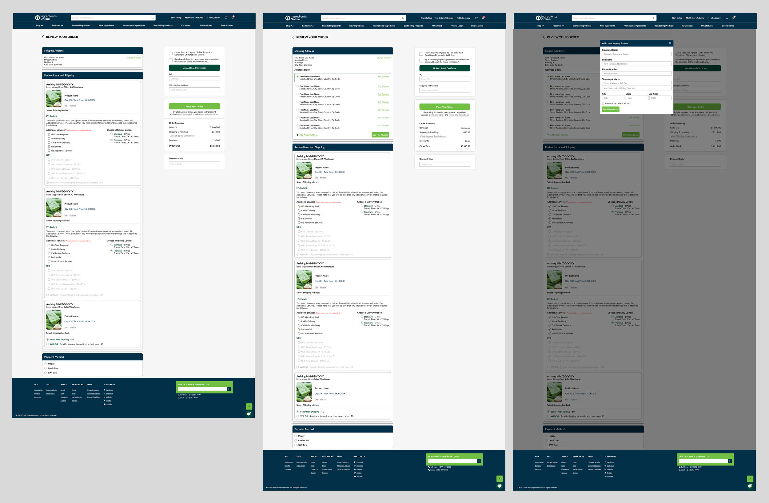
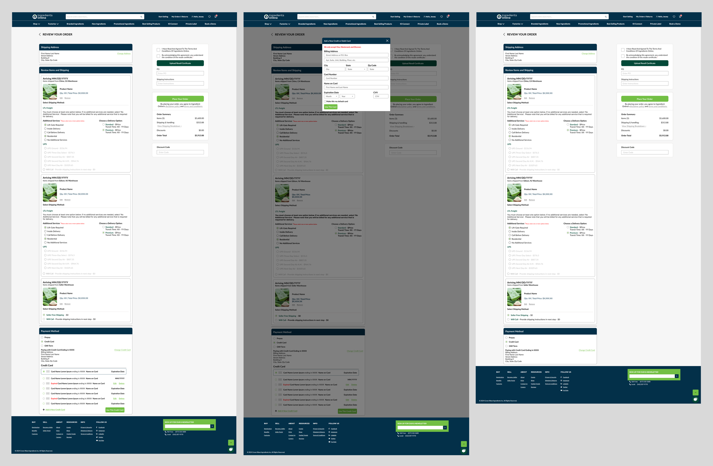
In the beginning, the user flow was difficult as buyers didn’t know where to start to select the shipping method as there wasn’t a clear priority in options. Many buyers tend to select a different shipping option such as economy or priority. However, additional services must be selected first. If there isn’t any additional service needed, a buyer must select “No Additional Services” to proceed. After interviewing stakeholders and the product owners, clearly separating each step and showing only the relevant information seems to help guide the buyers correctly. Different options are highlighted, and any previous choices are faded to grey to show that the buyer is now on a different step.
Exploration & Iteration
Products are separated by warehouses and various shipping options are presented under each warehouse. This helps to group products from the same warehouse to ship together to eliminate redundant shipping costs.
Solution
Priorities have been discussed and the team has determined that products would be separated by warehouses and various shipping options will be presented under each warehouse. This helps to group products from the same warehouse to ship together to eliminate redundant shipping costs. Furthermore, reducing the number of carriers and shipping options has helped to speed up the checkout process as the system doesn’t have to download large amounts of data to calculate shipping. Also, this has helped to reduce the cognitive load for buyers by displaying only a finite number of options.
Key Improvements:
o One-Page Checkout: Consolidated the checkout steps into a single, streamlined page, reducing user effort and time.
o Responsive Design: Ensured the checkout interface was fully responsive, providing a smooth experience on all devices.
o Visual Consistency: Applied a consistent design language throughout the checkout process, enhancing usability and trust.
o Expanded Payment Options: Integrated popular payment methods, including PayPal, Apple Pay, and Google Wallet, offering greater convenience and flexibility.
o Enhanced User Feedback: Implemented real-time validation, progress indicators, and clear error messages to guide users and reduce frustration.
Decision
After the design was created, I worked closely with the product owner, project managers, and the development team so that the experience matched the user flow. First, I got buy-in from the product owner and projected managers by explaining the interactions and my reasons as to selecting those interactions. After, I explained to the developers how the interactions worked based on what options were selected and the various moving parts.
The redesigned checkout process has led to significant improvements in key performance metrics:
o Conversion Rate: Increased by 15%, reflecting a smoother and more intuitive user experience.
o Cart Abandonment: Decreased by 20%, indicating a more engaging and efficient checkout process.
o Mobile Transactions: Increased by 25%, demonstrating the effectiveness of our responsive design.
o User Satisfaction: Positive feedback from users highlighted the simplicity, speed, and convenience of the new checkout experience.
The successful redesign of our checkout process underscores our commitment to enhancing the user experience and staying ahead in the competitive e-commerce landscape. By addressing user pain points and leveraging modern design principles, we have created a checkout process that not only meets but exceeds our customers' expectations.
Results
o Helping to reduce cognitive load and options for customers has helped to decrease the users’ frustrations and increase the satisfaction of using the system.
o By discovering and setting priorities, we are able to eliminate options that would make no impact or decrease the effectiveness as well as set a clearer path to a solution.


